

Anchor charts are co-created with students during a lesson and change as learning develops. Posters are pre-made, static visuals that stay fixed once they go up. If you need students to build understanding together, reach for an anchor chart. If you need a permanent reference like classroom rules or a schedule, a poster does the job better.
TL;DR:
- Anchor charts are co-created with students during lessons, which helps build understanding and ownership, unlike static posters that remain unchanged.
- Visuals built with student input reinforce memory through dual encoding, making anchor charts more effective than finished posters for learning retention.
- Use anchor charts for introducing new strategies or reinforcing concepts, and switch to posters for fixed, long-term classroom information.
- Plan a loose framework beforehand and involve students in filling it out during class to ensure the chart remains purposeful and used actively.
- Starting with simple templates like procedure, strategy, or vocabulary charts allows for quick adaptation and encourages ongoing student participation.
Table of Contents
- Anchor Charts vs Posters: The Core Differences
- Why Co-Creation Changes What Students Remember
- When to Use an Anchor Chart vs a Poster
- How to Build an Anchor Chart That Actually Gets Used
- Three Templates You Can Copy Tomorrow
- Why Teachers Trust This Guidance
- What Most Advice on This Topic Gets Backwards
- Resources That Turn Into Anchor Charts Fast
- Where to Read More on This Topic
- Sources
Anchor Charts vs Posters: The Core Differences
The confusion between these two tools usually comes down to authorship and timing. An anchor chart is built live, in front of students, during instruction. You start with a rough frame, and the class fills in the language, examples, and visuals together. A poster is finished before students ever see it, typically designed, printed, or laminated by the teacher or a publisher.
That difference in authorship changes everything else about how each tool functions.
- Anchor charts: co-created with students, built during the lesson, meant to evolve or get replaced, used as an active reference during practice.
- Posters: made in advance by the teacher, static once displayed, meant for long-term or permanent reference, rarely edited after posting.
- Shared trait: both are visual learning tools, and both can support recall when placed where students actually look.
Educators searching for a clean poster vs anchor chart comparison often assume one is simply a nicer version of the other. They are not interchangeable. One is a teaching process. The other is a finished product.
Why Co-Creation Changes What Students Remember
Co-creating a chart with students builds comprehension and independence in a way a finished poster cannot, according to Open Up Resources. When students supply their own words and examples, they see their thinking reflected on the wall, and that ownership carries into how they use the chart later during independent work.
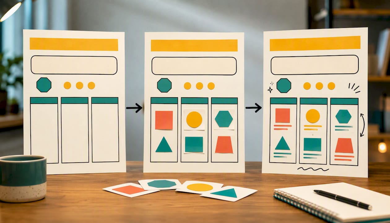
There’s a cognitive reason this works. Anchor charts pair spoken explanation with a visual record built in real time, which is the basic principle behind dual coding: information encoded two ways sticks better than information delivered only one way. A poster you hang up without discussion skips that pairing entirely. Students see it, but they never build it, so the visual carries less weight in memory.
Effective anchor charts are co-constructed, simple, and useful. That’s the exact framing Lesley University’s Center for Literacy Teaching uses, and it’s worth repeating because teachers often drift toward the opposite. A few common missteps:
- Over-decorating a chart until the content gets lost in the design.
- Leaving every chart up all year, which turns walls into visual noise students stop scanning.
- Building charts nobody refers back to during actual practice.
Heavy classroom decoration can quietly work against attention, not for it. Keep charts legible, keep them purposeful, and take them down once students no longer need the scaffold.
When to Use an Anchor Chart vs a Poster
Match the tool to the job, not the other way around. Here’s how that plays out in a real week of teaching:
- Introducing a new strategy or process (like a reading comprehension move or a math problem-solving routine) calls for an anchor chart, built with students as they learn the steps.
- Displaying permanent classroom information (rules, daily schedule, emergency procedures) calls for a poster, since that content shouldn’t shift day to day.
- Reinforcing vocabulary or content mid-unit works best as an anchor chart students help build, then consult during independent work.
Run new visuals through a short checklist before you decide: Who is making it, you or the class together? How long does it need to stay up, days or the whole year? Do students need to physically interact with it, or just glance at it? And does the layout work for every reader, including students who need larger text or higher contrast?
Pro Tip: If you’re not sure which one you need, ask whether the content will change as students learn more. If yes, it’s an anchor chart. If the answer is no, hang a poster and move on.
How to Build an Anchor Chart That Actually Gets Used
Anchor charts work best when teachers plan a rough frame in advance, then let the class fill in language and examples during the lesson, according to We Are Teachers. That balance between preparation and spontaneity is the whole method.
- Plan ahead. Set the learning target and sketch a loose frame (a title, maybe two or three empty sections) before class starts.
- Co-create it live. Capture student phrasing as they say it, add simple visuals, and keep your handwriting large and legible.
- Use it during practice. Point to the chart when students ask questions. Require them to check it before asking you directly.
- Fade it out. Once most students have the concept internalized, cover or remove the chart. Hand out mini versions for notebooks so the reference travels with them.
A few practical habits make the difference between a chart students use and one they ignore:
- Use consistent colors for categories (blue for questions, green for definitions) so the eye finds information fast.
- Write large enough to read from the back row.
- Leave white space. A crowded chart is harder to scan than a sparse one.
Mini anchor charts glued into notebooks let students carry a personal copy into independent work or homework, according to We Are Teachers, which solves the problem of a great classroom chart doing nothing for a student working at home.
Three Templates You Can Copy Tomorrow
Most useful anchor charts fall into one of three shapes:
- Procedure chart: numbered steps down the left side, blank space beside each for a student example filled in during the lesson.
- Strategy chart: a central visual (an arrow, a cycle, a flowchart) with short phrases at each stage and room for two or three worked examples.
- Vocabulary chart: three columns, word, a student-written example sentence, and a quick sketch or icon as a visual cue.
Picture the same fraction lesson taught two ways. A teacher-made poster shows the finished rule with one polished example, no room for edits. A co-created anchor chart starts blank, and by the end of the period it holds three student-generated examples in their own words, visibly messier but far more tied to what that specific class actually understood.
Why Teachers Trust This Guidance
Visual, hands-on resources are used by many teachers, parents, and therapists to teach concepts like fractions, geography, and emotional intelligence. That same visual-first approach underlies everything here about anchor charts.
- Printable infographics from Edhed Learning are designed to be adapted directly into classroom anchor charts or notebook-sized mini-charts.
- Related classroom resources, including ADHD routine charts and emotion charts for naming feelings, follow the same co-creation logic described above.
- The broader case for pairing visual learning with printable practice rests on the same dual coding principle behind effective anchor charts.
What Most Advice on This Topic Gets Backwards
Most classroom advice treats anchor charts and posters as a style choice, pick whichever looks nicer on Pinterest. That framing misses the point entirely. The research on co-construction isn’t about aesthetics. It’s about who does the cognitive work of building the chart. When you make a beautiful poster the night before, you did the thinking. When your students help build a messier chart in real time, they did it.
The overrated piece of conventional wisdom here is polish. A gorgeous, teacher-made anchor chart that never gets edited during instruction isn’t really an anchor chart. It’s a poster wearing a different name. If you take one thing from this guide, prioritize the process over the product: sketch a loose frame, let students fill it in imperfectly, and accept that a chart built with twenty seven-year-olds will never look like a Pinterest board. That’s the whole point. A progress tracking approach works the same way, the value comes from ongoing student input, not a polished starting point.
Where teachers should focus first isn’t design software or laminators. It’s the five minutes of planning before class where you decide what the chart’s bones will be, and how much you’re willing to leave blank for your students to fill.
— Shaun
Resources That Turn Into Anchor Charts Fast
You don’t have to build every visual from scratch. Several Edhed Learning packs are already structured the way strong anchor charts are, clear categories, simple visuals, and space for student thinking, which cuts your prep time down to adapting rather than designing.
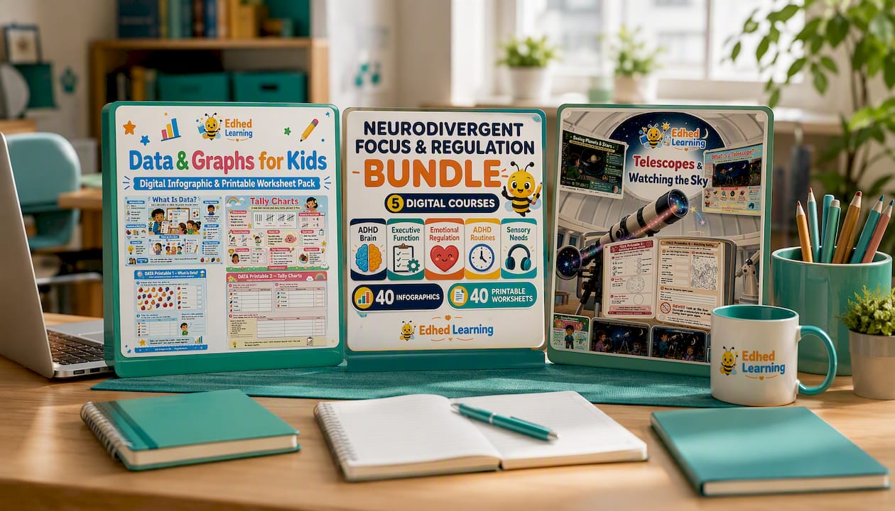
The Data & Graphs for Kids course gives you ready-made infographic pages you can enlarge into a classroom chart, then let students annotate with their own data during the lesson. The Desert Survivors infographic pack and Food Chains & Food Webs pack work the same way for science units, print the base visual, leave blank space, and fill it in as a class. For younger writers, the Grade 1 Creative Writing Worksheets and Grade 1 Punctuation Worksheets turn into procedure-style charts in minutes, while the Grade 4 Creative Writing Worksheets support the strategy-chart format for older students tackling multi-step writing tasks.
To convert any of these into an anchor chart: print the base infographic large, leave two or three sections blank on purpose, then fill those gaps with student language during the actual lesson. For a full-year literacy plan, the Early Literacy Foundations bundle and the Grade 4 to 5 Phonics Mastery bundle give you a stocked library to pull from all year. Browse the full Edhed Learning catalog to find a starting visual for your next unit.
Where to Read More on This Topic
For deeper reading beyond this guide, start with Open Up Resources on keeping charts meaningful rather than decorative, and Lesley University’s Center for Literacy Teaching on co-construction during minilessons. For classroom examples and ELL-friendly adaptations, check We Are Teachers and Colorín Colorado.
Sources
- Making anchor charts meaningful (not just pretty) - Open Up Resources
- Creating effective anchor charts in your minilessons - Lesley University
- Anchor Charts 101: Why and How To Use Them - We Are Teachers
- Anchor Charts - Colorín Colorado


